Lumière
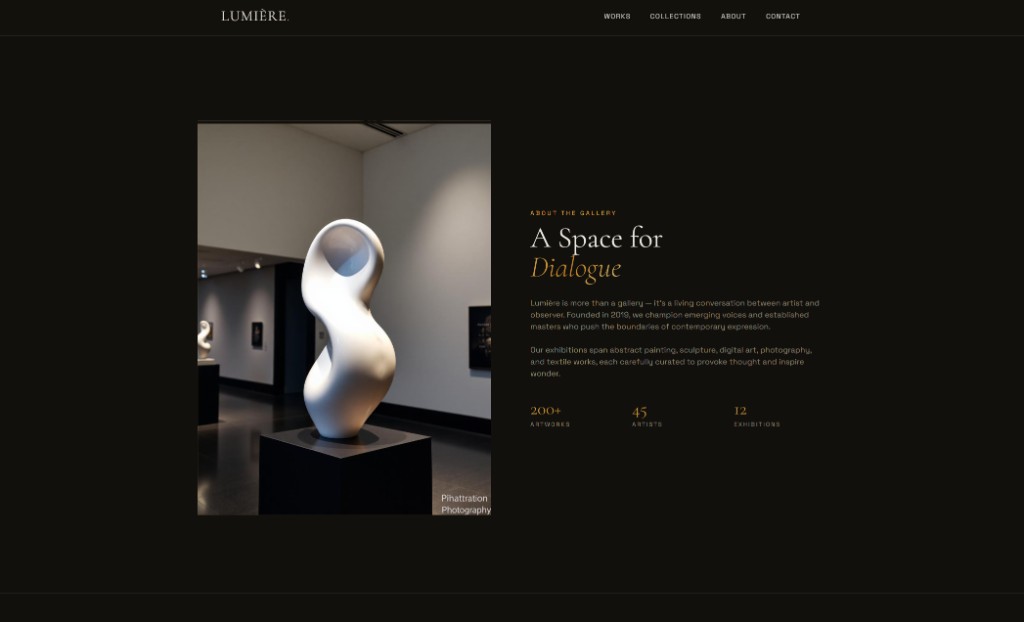
Lumière is a contemporary art gallery site built for immersion. The homepage blends a hero film or still, featured works with artist and year metadata, horizontal category marquees, and a curated collection grid. A swipe-based explore section invites discovery, while about copy explains the gallery mission and metrics (artworks, artists, exhibitions). Visit and contact close with hours and private viewing language.
Client: Lumière Gallery · 2026
View Live Site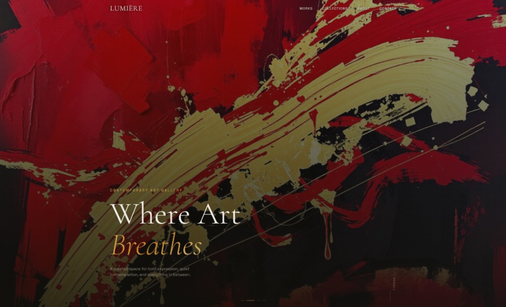
The Challenge
Galleries need to feel alive online — not like a PDF catalog. Lumière needed to surface many works and categories without overwhelming navigation, and to signal prestige while remaining accessible for first-time visitors booking a visit.
Our Solution
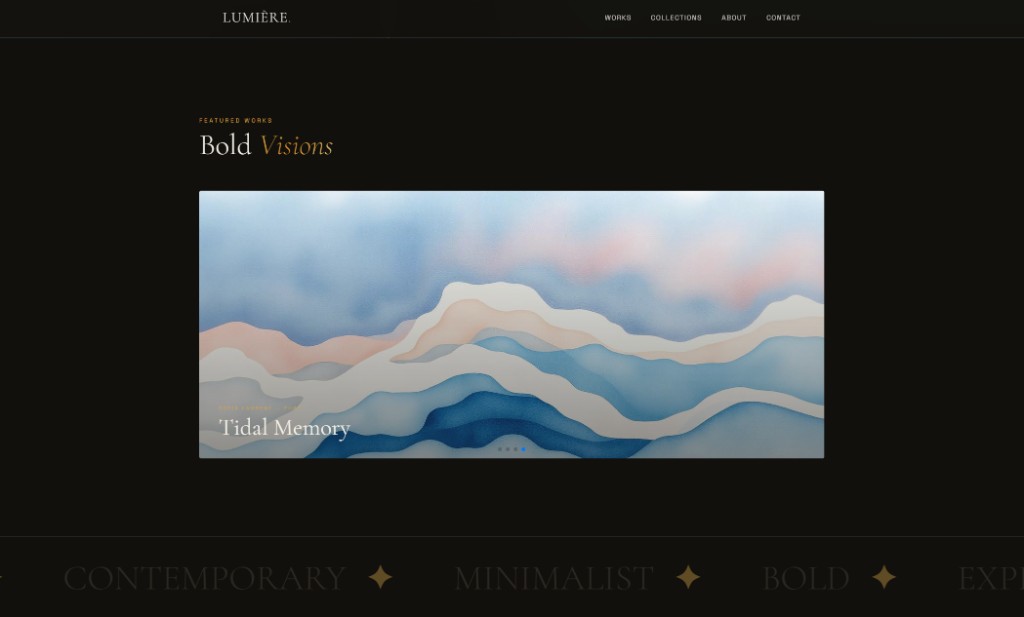
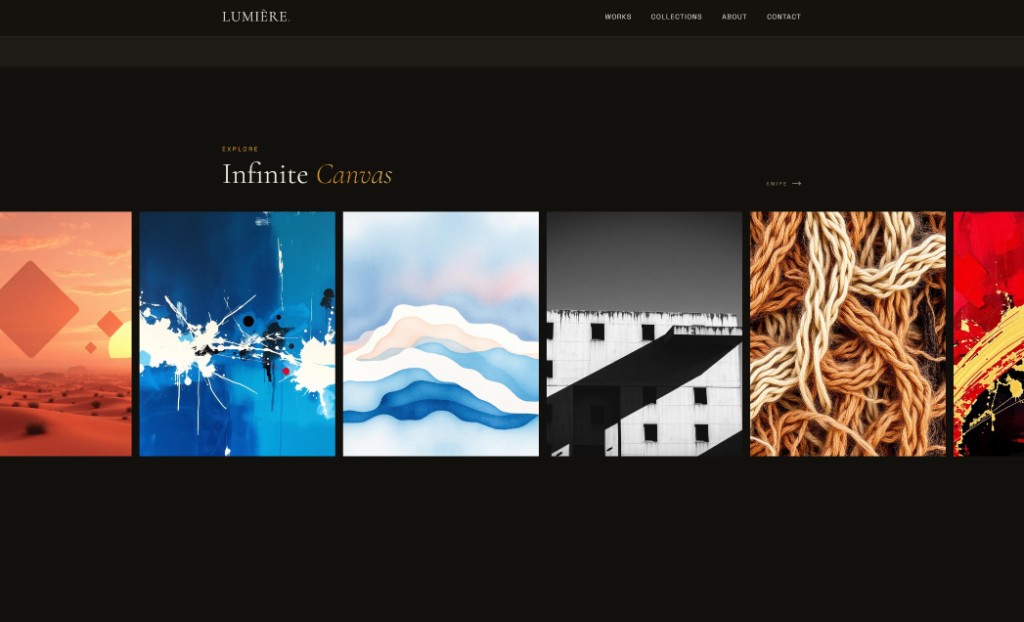
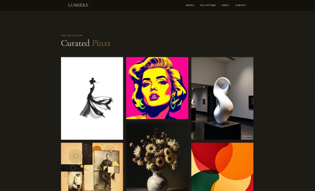
We leaned into motion-rich modules: marquee keywords, stacked featured cards, and swipeable rails that mimic in-gallery browsing. Typography and spacing mirror print exhibition design, and repeated soft CTAs invite private viewings without breaking the artistic tone.
What We Delivered
Project Gallery
"Collectors and students both find what they need in seconds. The motion feels like part of the art direction — we finally have a digital room that matches our physical space."
Amélie Fortin
Director, Lumière Gallery